- | 8:00 am
Unboxing the delightful UX of Apple’s boxes
Exploring the intersection of design, psychology, and consumer culture in Apple’s packaging strategy.
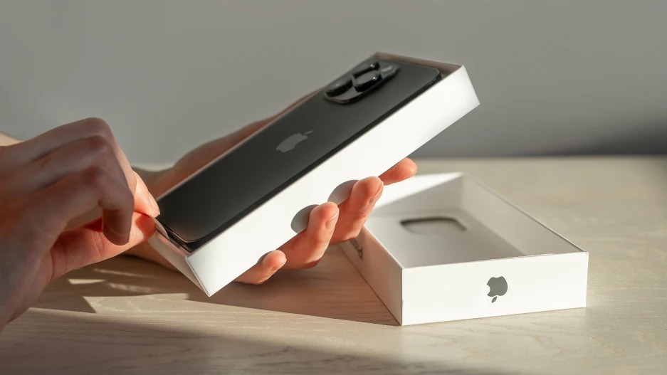
Have you ever unboxed an Apple product? If so, chances are you remember the experience. The sensation of lifting the perfectly fitted lid, the first glimpse of the gleaming device nestled within, even the faint new-product smell that accompanies it. It’s a sensory journey that begins well before you power on your new device. But once the novelty of the new gadget subsides, what happens to the box it came in?
For many people, the answer is simple: They keep it. But why?
In a world increasingly conscious of consumption and waste, the phenomenon of keeping product packaging might seem counterintuitive. After all, once its protective role is fulfilled, why does the box hold value? However, when it comes to Apple, a brand synonymous with innovation, quality, and a certain aspirational lifestyle.
The packaging is viewed as much more than just a protective shell, it’s an extension of the product experience and the Apple brand itself.
Let’s dive into the world of Apple’s packaging, exploring why it has such a hold over consumers. Through the lens of design philosophy, psychological principles, and consumer culture, we will unravel the unspoken value of Apple’s packaging and why it so often escapes the fate of the recycling bin. Welcome to the journey through the life of an Apple box, a journey that often extends far beyond its initial unboxing.
DESIGN PHILOSOPHY AND USER EXPERIENCE
Apple’s design philosophy can be summarized in one word: simplicity.
From the design of its software to its hardware, and indeed, its packaging, the goal is to make complex technology accessible, intuitive, and aesthetically pleasing.
This philosophy was famously encapsulated by Steve Jobs’ statement that
Design is not just what it looks like and feels like. Design is how it works.
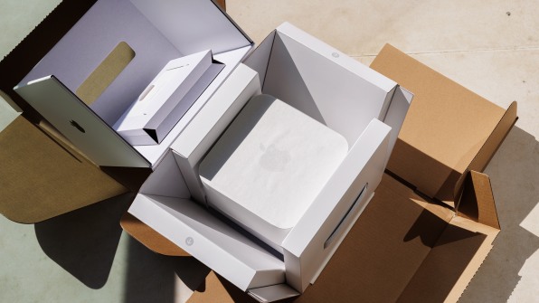
Nowhere is this ethos more evident than in the design of Apple’s packaging. Here, simplicity reigns supreme. Apple’s boxes typically consist of a lower base and an upper lid that fits snugly over it, offering an almost seamless unboxing experience. The high-quality, rigid cardboard material ensures durability, while the white, minimalist aesthetic speaks volumes about the product inside.
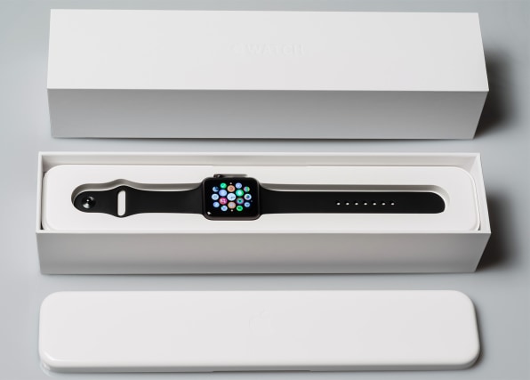
Every detail is meticulously considered, from the placement of the product image on the box to the arrangement of the accessories inside. Even the absence of traditional packaging elements, such as visible tabs or creases, is deliberate. These choices serve to create an uncluttered and premium feel, mirroring the seamless, user-friendly experience of the Apple products themselves.
In fact, one could argue that the unboxing process serves as a precursor to using the product. Just as Apple’s software guides the user intuitively, the packaging eases the user into the product experience. The box opens smoothly, the product and accessories are arranged logically, and setup instructions are clear and minimal.
This attention to detail in packaging design reflects Apple’s overarching design philosophy. It’s about creating a user experience that is not just functional but delightful. It’s about turning the ordinary into something extraordinary. And this is a big part of why people hold onto Apple packaging. The box, like the product it once held, stands as a testament to the design values Apple espouses, a physical embodiment of a philosophy that prizes simplicity, functionality, and beauty.
Apple products are renowned for their minimalist aesthetic, user-friendly interfaces, and cutting-edge technology. Each product, from Macs to iPhones to AirPods, is not only designed to look good but to provide a seamless and intuitive user experience. This design-centric approach has been a key differentiator for Apple, setting it apart in an otherwise crowded marketplace.
Moreover, Apple’s branding extends to the entire customer journey. It’s not just about the moment you start using a new iPhone or MacBook, but it begins from the very instant you enter an Apple Store or browse their website, continues through the process of purchasing and unboxing the product, and persists through the life of the product and beyond. This holistic approach to the customer experience is a testament to Apple’s brand strategy.
This brings us to the question: How does packaging fit into this narrative? The answer is simple, just as the Apple brand is about more than just its products, the Apple packaging is about more than just housing those products. It is an integral part of the Apple brand experience, a physical manifestation of the brand’s commitment to quality, design, and attention to detail. The packaging, like the product it houses, is designed to be appreciated and valued, becoming a part of the Apple brand story in its own right.
And so, the Apple box becomes more than just a box. It becomes a keepsake, a symbol of the user’s affiliation with the Apple brand, an object that holds its own significance. This is where the unspoken value of Apple’s packaging begins.
THE UNBOXING EXPERIENCE
In recent years, a unique genre of videos categorized as unboxing videos. These videos, which capture the process of opening and unpacking new products, have amassed millions of views worldwide. The unboxing of Apple products, in particular, is a popular subset of this genre, and this phenomenon highlights the allure and importance of the unboxing experience.
When you unbox an Apple product, you’re not merely opening a box, you’re engaging in a ritual. The very act of unboxing is designed to build anticipation and create a memorable first interaction with the product. As the perfectly fitted lid is slowly lifted, revealing the product nestled within, there’s a palpable sense of drama and reveal, akin to a theatrical performance.
The unboxing experience extends even to the way the accessories and product information are packaged. Every item has its own place. Accessories are tucked away neatly in compartments or envelopes, often with small tabs that allow you to lift them out easily. In every aspect, the design of the box and the arrangement of the contents are created with intention, ensuring a smooth and enjoyable unboxing process.
Apple’s unboxing experience reflects the brand’s commitment to providing a seamless, user-friendly experience at every stage of the product journey. The tactile pleasure of opening the box, the visual appeal of the product and accessories arranged within, and the ease of setup all contribute to a positive first impression of the product.
For many consumers, this unboxing experience is a significant part of the value of purchasing an Apple product. It’s a testament to Apple’s meticulous design and attention to detail and enhances the overall product experience. This is why the unboxing process doesn’t end when the product is removed. Instead, the box, a symbol of this memorable experience, is often kept as a keepsake.
PSYCHOLOGY OF WHY PEOPLE LIKE KEEPING APPLE’S BOXES
At the heart of Apple’s packaging allure lies an intricate web of psychological factors that contribute to its perceived value. On a surface level, Apple’s minimalist packaging design may just seem like an aesthetic choice. However, underneath this simple design lies a clever psychological strategy that triggers a series of responses in our brains, leading to a much deeper connection with the brand and the products.
One of the key psychological principles at play is the Endowment Effect.
This principle suggests that people place a higher value on objects simply because they own them.
When consumers purchase an Apple product, they don’t just acquire the physical device, but also the whole package, which includes the packaging itself. By producing high-quality, aesthetically pleasing packaging, Apple enhances the ownership experience, making the packaging seem valuable and worth keeping.
Another psychological principle Apple taps into is the Halo Effect.
This cognitive bias refers to our tendency to let our impression of someone or something in one domain influence our impression of them in other domains.
As a result of Apple’s robust brand reputation and the high quality of its products, consumers are likely to perceive its packaging as superior as well.
Apple’s packaging also taps into our desire for luxury and status. The sleek, minimalist design of Apple’s packaging, coupled with the anticipation built into the unboxing process, creates a luxurious experience akin to unboxing a high-end fashion item. This feeling of luxury not only enhances the perceived value of the product but also satisfies our innate social desire for status and prestige.
The psychology of color also plays a role in the appeal of Apple’s packaging. The brand’s iconic white packaging communicates simplicity, purity, and sophistication. Color psychologists suggest that white also creates a sense of space and openness, which could contribute to the feeling of anticipation and discovery during the unboxing process.
Finally, the very act of opening a box taps into our inherent curiosity and love for surprises. Unboxing a product offers a tangible way to satisfy this curiosity, adding an element of joy and discovery to the product experience.
These psychological principles intertwine to create a powerful emotional response, transforming the packaging from a mere protective shell into an integral part of the product experience that consumers are reluctant to discard.
SOCIAL IMPLICATIONS OF THE APPLE FETISH
As we dive deeper into the socio-economic implications of the Apple packaging phenomenon, it’s essential to touch on the concept of commodity fetishism. This term, coined by the philosopherKarl Marx, refers to the process by which goods and commodities are ascribed an intrinsic value or “magic” that goes beyond their practical use.
Commodity fetishism refers to the perception that the value of a good is inherent in the good itself, rather than a product of the human labor involved in its production.
Apple, as a brand, has been successful in imbuing its packaging with a perceived inherent value, transforming it from a simple protective casing into a desirable object in itself.
Its products and by extension, its packaging have come to represent more than just technological tools. They are symbols of a certain lifestyle, of status, of being part of the “Apple ecosystem”. This transformation of commodities into objects of desire is at the heart of commodity fetishism.
Apple’s packaging, with its high-quality materials and minimalist design, echoes the value attributed to the product inside. As such, the packaging takes on a life of its own, perceived not just as a protective shell but as a valuable commodity in itself.
This perspective is reinforced by the secondary market for Apple packaging. The fact that people are willing to buy and sell empty Apple boxes signifies that the packaging is seen as having inherent value, separate from the product it once contained.
This fetishization of Apple packaging can be viewed as a reflection of broader societal values and consumer culture. It speaks to the power of branding and design in influencing our perceptions of value, and our desire for material symbols of status and identity.
However, it’s also important to note that this phenomenon is not without its critiques. Some argue that this attachment to packaging contributes to environmental waste and perpetuates a culture of overconsumption.
SECONDARY MARKET
Perhaps one of the most intriguing phenomena related to Apple’s packaging is the existence of a secondary market for it. Visit online marketplaces like eBay or Craigslist, and you’ll find numerous listings for empty Apple boxes. Some might question why anyone would purchase an empty box, but the existence of this market is a testament to the perceived value of Apple’s packaging.
These boxes are sought after for a variety of reasons. Some buyers may have lost or damaged their original packaging and want a replacement to maintain the value of their product for resale. This is because second-hand Apple products with their original packaging often command higher prices than those without.
Others might be collectors, viewing the packaging as a form of memorabilia, especially for older or limited edition products. This form of collection mirrors trends in other industries such as sneakers or designer fashion, where the packaging often plays a role in the overall collector’s experience.
Yet another category of buyers may be seeking the boxes as props for creating social media content, highlighting the role of Apple packaging in the digital “unboxing” phenomenon.
What all of these buyers have in common is the recognition of value in something that would traditionally be viewed as disposable. The secondary market for Apple packaging reflects the successful integration of the packaging into the overall product experience, so much so that it retains perceived value even in the absence of the product itself.
While the existence of this market might be viewed as a triumph of branding and design, it also raises interesting questions about consumption and waste.
FINAL THOUGHTS
From a physical manifestation of Apple’s design philosophy to a valuable commodity in its own right, Apple’s packaging has come a long way. The reluctance to discard these boxes, often seen as keepsakes, and the existence of a secondary market, reflect the immense success of Apple’s branding and design strategy. They have transformed what was once merely a protective casing into an integral part of the product experience, adding to the perceived value of Apple products.
However, while we celebrate this triumph of design, we must also recognize its implications. The attachment to packaging has environmental implications, contributing to the clutter and waste in our homes and on our planet. It’s essential to balance our admiration for design and branding with a commitment to sustainability and conscious consumption.
Through this exploration of Apple’s packaging, we have seen the power of design, branding, and psychology in shaping consumer behavior. And as consumers, it offers an opportunity for reflection on our own relationship with packaging and the values we ascribe to it.
This article was originally published in UX Collective on Medium and is reprinted with permission.


