- | 8:00 am
What makes a logo feel ‘normal’?
Pepsi’s recent logo change was celebrated as a return to normalcy. But are there drawbacks to playing it safe with branding?
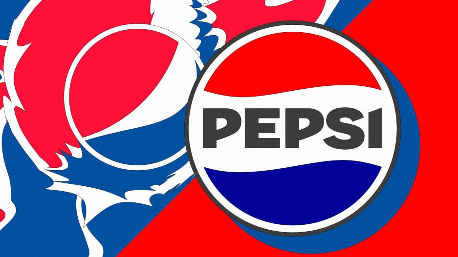
In March, when Pepsi unveiled its logo and brand redesign, some focused on an interesting characteristic of the design: its familiarity. The logo returned the “Pepsi” word mark “back into the company’s patriotic yin-yang ‘globe’—right where it lived for any child of the ’80s or ’90s,” noted Fast Company’s Mark Wilson.
“Pepsi’s Logo Finally Looks Normal Again,” read a headline in Food & Wine. Others took the opportunity to revisit Pepsi’s somewhat unenthusiastically received 2008 rebrand. Naming expert Nancy Friedman recently eulogized the mark as “Pepsi’s Weirdest Logo,” in part because of the infamous “Breathtaking” brand document, with its talk of “Pepsi energy fields” and “perimeter oscillations,” that accompanied its introduction.
But what makes a logo “weird” or “normal”? And are there drawbacks to playing it safe?
In Pepsi’s case, the widespread consensus seems to be that the brand has done well to take a step back and adopt a look that hewed closer to its earlier incarnations. It’s striking that in the world of branding—a practice in which distinctiveness and differentiation are held as the ultimate goals—normalcy would be so highly regarded.
But the reality is that even in branding, a field that values “outside the box” thinking, there is still a box, and it’s full of expectations, prescriptions, and norms. Sometimes following the rules is what a brand needs to do to be viewed as trustworthy, legitimate, or simply “normal.” That may explain why 77% of NBA team logos feature basketballs.

Of all brands, Pepsi seems among the least likely to go for normal. As the perennial challenger to industry leader Coca-Cola, Pepsi has long defined itself as new and different in contrast to Coke’s brand of reliable sameness. But soon after the debut of its asymmetrical 2008 logo, there was a sense that Pepsi had strayed too far.
At the time, logo trend guru Bill Gardner lamented the loss of Pepsi’s “wave” (the undulating white section in the old logo, which, it’s worth noting, was copied by Coke’s 1969 “dynamic ribbon”): “By taking away the wave, they just stole the legs out from under Pepsi,” he said. “My sense is that in five years, they will go back to the wave.” It ended up taking a decade longer, but he was right.
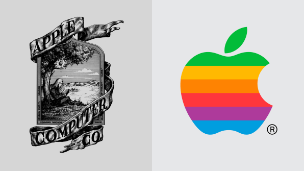
Some brands start out weird and gradually drift into the mainstream. Apple’s initial 1976 trademark, an elaborate illustration of Isaac Newton under an apple tree, was quickly replaced by a rainbow-striped logo that was unconventional in its own way. Eventually the stripes disappeared, and we were left with today’s monochromatic mark that is restrained but still possesses abundant distinctiveness. Prudential repeatedly simplified its Rock of Gibraltar logo for years until its 1984 mark got a little too kooky, resembling a sinking UPC code. The 1989 rebrand eliminated this weirdness.
Some logos embrace weirdness and never look back. The logo for the 2012 London Olympics ultimately succeeded by drawing attention and remaining unchanged in the face of public outcry over its brutal ugliness. Airbnb’s 2014 “Bélo” mark survived the puerile onslaught of the social media mob’s anatomical comparisons and went on to become a trendsetting symbol. Of course, even being weird may not be enough to make you distinctive if someone else is being weird in the same way, as the cities of Austin and Portland found out.
For every weird logo, you’ll find a multitude of brands keen to play it safe, even at the risk of appearing boring. You likely won’t find any paeans to the Costco logo in today’s design discourse, but with a little italicization here and some ruled lines there, it gets the job done for the nation’s 11th-largest corporation. No one is refusing to enter a Costco because they didn’t like the logo.
Which approach performs better? Obviously, the nature of the brand that the logo represents is quite important in answering this question; a brand being positioned as edgy might adopt an unusual logo, while a more buttoned-up concern is likely to stick with a normie look.
Ultimately, whether a company goes conventional or quirky with its logo, it can still have staying power. My analysis of U.S. Patent and Trademark Office data found that the weirdest logos—those that deviate the most from the logo design norms of their industry—are actually 19% more likely than average to survive in use over time. Interestingly, the most conventional or “normal” logos also tend to stick around longer than average (8% more likely). So perhaps it’s best when it comes to logo design to either be weird or normal, and not get stuck somewhere in between.


