- | 9:00 am
Why concerns about OpenAI’s new logo are about more than design
Can a simple circle really be ‘ominous’? The ChatGPT creator’s potential logo change is a brand Rorschach test.
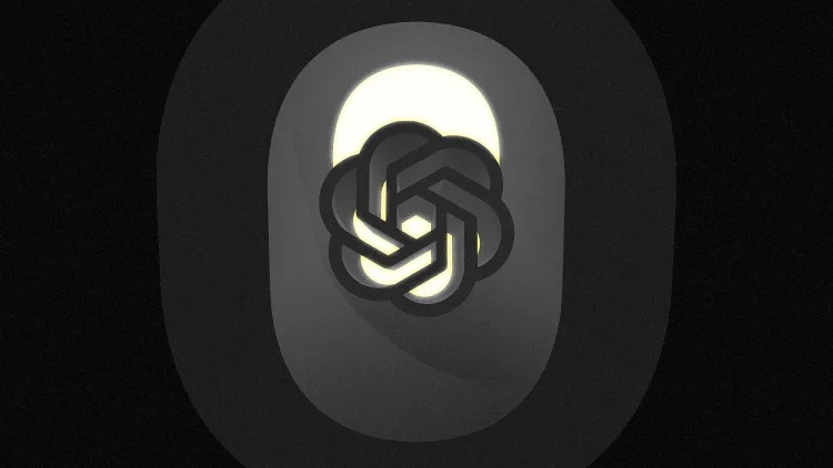
Just as OpenAI inspired a wave of AI startups, so, too, has its logo. OpenAI’s signature spiral logo has become widely mimicked in the industry. So it raised eyebrows when Fortune recently reported that the company was changing its logo to something way more simple: a plain black circle. And the interest around OpenAI’s possible rebranding goes well beyond issues of graphic symbolism.
OpenAI employees were reportedly “taken aback” by the company’s plans to introduce the black circle or letter “O” as its new logo, which some dubbed “lacking in creativity” and “ominous.” That might seem silly to some. What, after all, is so threatening about a circle? The logos for Target, USA Today, and Oprah’s magazine don’t appear to be scaring anybody. But logos, particularly unfamiliar, abstract logos, can function something like Rorschach tests, compelling us to project our feelings about the company they represent onto the symbol itself.
While OpenAI’s current spiral logo was intended, according to its co-designer Ben Barry, to depict “optimism and a burst of intelligence” and “transformation into something beautiful,” its association with uncanny and creepy developments in artificial intelligence have given the logo and its imitators the feeling of forbidding whirlpools, closing and flowing downward, rather than blossoming outward.
These opposing readings of this type of logo have shown up elsewhere. The cover of Dave Eggers’s 2021 dystopian novel The Every features the symbol of the book’s titular tech behemoth, designed by star illustrator Jessica Hische, which looks a lot like OpenAI’s. Early in the story, Eggers describes the Every logo: “It was three waves crashing around a perfect circle, and hinted at the flow of water, the bursting of new ideas, of interconnectivity, at infinity.” But on the book’s copyright page, Eggers calls the logo “secretly disturbing.”
Interestingly, Hische revealed that she had designed the Every logo in 2013, four years before the OpenAI mark’s debut, while exploring options for the cover of the Eggers novel that The Every would become the sequel to. Its title, also a reference to a sinister tech company? Yep, The Circle.
Why might OpenAI want to switch to using a simple circle as a logo, ditching seven years of brand equity in its current trendsetting mark? There doesn’t seem to be a great answer. With so many other AI firms having adopted similar swirly marks, OpenAI would essentially be making a spiteful Sneetches move: Once everyone else has a star on their belly, it’s time to erase the one on yours. Fortune’s report that the company’s rebranding is partially motivated by intellectual property considerations—OpenAI reportedly does not own the typeface used in its current wordmark—is interesting, given the many accusations of copyright infringement leveled against the company. (OpenAI did not respond to a request to comment on the report.)
And why a circle, specifically? It, too, is a popular symbol. According to analysis of United States Patent and Trademark Office records, 21 percent of current American logos incorporate a circle of some sort. Virtually all of these, though, add some other design elements, be they General Electric’s initials or BMW’s snippet of the Bavarian flag.
As companies become more well-known, their logos have to do less of the heavy lifting needed to communicate their identity, so they can become simpler over time. Nike and Starbucks, for example, were both able to drop their names from their logos, as they remained identifiable without them. After Starbucks did so, a meme circulated online jokingly suggesting that by 2041, the coffee giant’s logo would simply be a green circle.
OpenAI is the biggest brand in AI, but to try to pull off such a move in real life would show some real hubris. Still, there’s evidence beyond the Fortune story that OpenAI is serious; last year, it filed a trademark registration for its cash cow large language model ChatGPT featuring just the name and a simple black circle. And indeed, if you use ChatGPT’s Voice Mode, you find yourself talking to that circle.
An abrupt logo change that goes beyond a mere update or glow-up and introduces a new symbol created from whole cloth is quite rare among established companies. It often signals one of two things. It may indicate some sort of fundamental change in the business itself, as when the court-mandated breakup of AT&T in the early 1980s resulted in the company adopting its new “Death Star” logo. Alternatively, it may accompany a change in leadership, as when Elon Musk bid adieu to all Twitter’s birds last year.
In OpenAI’s case, either or both of these explanations may be in play. The company is in the midst of a major transformation, moving from its current capped-profit status to become a for-profit enterprise, and raising venture capital that would reflect a 12-figure valuation, even as one key employee after another jumps ship. At the same time, many of the questions raised by last year’s failed coup d’etat against CEO Sam Altman have not been answered, and it’s reasonable to wonder how much his personality may be driving the rebrand.
In any case, the concern with OpenAI’s ostensible ominous “O” is not simply about corporate aesthetics. It appears to be a sign of weightier goings-on within the company. And as they play out over the coming months, logo-watchers will have their popcorn ready.


