- | 9:16 am
The masterminds behind Burger King’s epic redesign unveil their latest rebrand—and it’s even more delicious
Magnolia Bakery’s new cupcake-inspired logo by Jones Knowles Ritchie’s Lisa Smith is sweet by design.


It’s hard to remember life in 1996. It was a time when nobody cared about cupcakes; they were the bargain bin dessert brought to children’s classrooms celebrating a birthday. And the prospect of mailing someone a cupcake would have been absurd.
But then Carrie Bradshaw ate a cupcake on Sex in the City—specifically, a cupcake from Magnolia Bakery in New York City’s West Village—and the world changed. Not only did Magnolia become an international sensation and a must-visit destination for tourists; it also helped launch the viral baked goods revolution, which has given us everything from cronuts to rainbow bagels.
[Image: ™ & © Magnolia Bakery/courtesy Jones Knowles Ritchie]
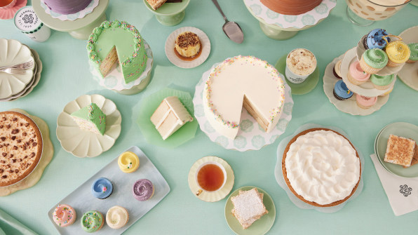
Over these 25 years, Magnolia Bakery was sold and expanded to include 10 owned and 25 franchised locations globally. Sold again to the developers behind Hudson Yards in 2021, Magnolia Bakery today is as much a bakery as it is an empire.Yet while Magnolia’s cupcakes have stood the test of time, its branding has been stuck in another era.
[Image: ™ & © Magnolia Bakery/courtesy Jones Knowles Ritchie]
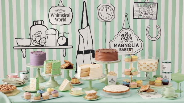
Thanks to platforms like Goldbelly, gourmet food is less a destination than a shippable commodity, something you spot on Instagram then order online. But until this week, Magnolia’s branding was centered on a brick-and-mortar bakery.Now, Magnolia has revealed a whimsical new brand identity developed by creative consultancy Jones Knowles Ritchie (JKR). It includes a new logo, wordmark, and packaging to mail Magnolia’s goods nationwide.
[Image: ™ & © Magnolia Bakery/courtesy Jones Knowles Ritchie]
“We’re still the same favorite neighborhood bakery, but it’s taken a new meaning to us as a business,” says Magnolia Bakery’s chief marketing officer, Eddie Revis, referring to the company’s direct-to-consumer offering, which launched in October last year, and its expanded presence on social media platforms like Instagram and TikTok.
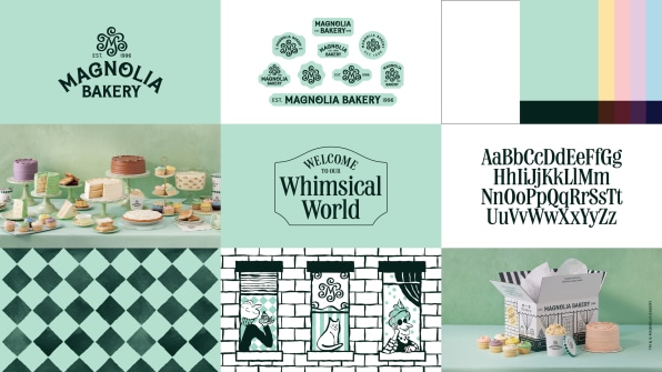
THE SWEET NEW VISUAL STRATEGY
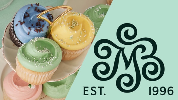
The crown jewel of the new brand is its logo. It’s a monogram M inspired by the Magnolia cupcake—a carefully branded object unto itself, frosted with a seemingly casual swirl that’s actually trademarked by the company and takes up to 40 hours of study to perfect. JKR translated the frosting flourish into graphics, surrounding the M with five swirls that grow in front of your eyes in animated versions.
The brand is an intentional “bite of whimsical delight,” according to Lisa Smith, executive creative director at JKR and the mastermind behind the beloved Burger King rebrand. The Magnolia logo, like so much of the brand, is a playful bit of excess that primes you for a sugar bomb.
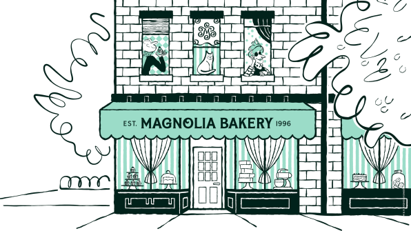
[Image: ™ & © Magnolia Bakery/courtesy Jones Knowles Ritchie]
The new wordmark, however, is far more restrained than the previous iteration, which featured swirls on almost every letter. The updated version is more stately, tipping its sweet tooth only on the letters G and O.
“We wanted to modernize it and make it dynamic,” Smith says. “The wordmark can be straight, stacked, or arched; it has a lot of flexibility [for social media]. And if you make every letter have flourishes, it gets too complicated. . . . We needed that balance of hardworking [legibility] and just enough whimsy.”
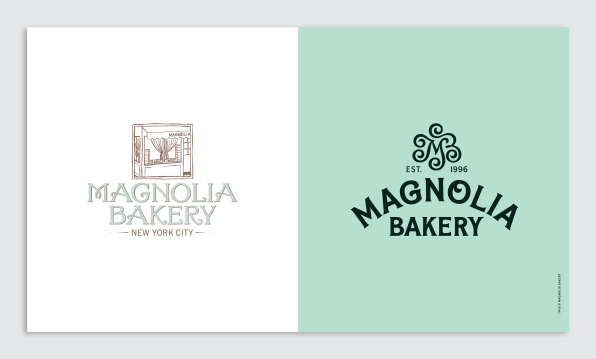
Indeed, it’s easy to imagine how much more readily this pliable wordmark can be squeezed into social media posts or onto signs of various dimensions. (Though my one qualm with the new wordmark is that the “MA” of “Magnolia” looks a bit like that of the Maggiano’s Italian restaurant chain.)
[Image: ™ & © Magnolia Bakery/courtesy Jones Knowles Ritchie]
As for the brand’s updated color palette: That was inspired directly by the West Village decor, and just as importantly, its famous baked goods. The green (which the company now simply dubs “Magnolia Green”) was copied from the bakery’s walls. The blue came from the building’s awnings. Its other pastels were pulled right from Magnolia’s cupcakes, except the yellow, which comes from its popular banana pudding.
SHIPPING A DOLLHOUSE FILLED WITH CAKE
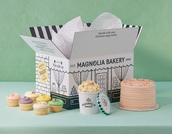
Given that a big reason for the rebranding was Magnolia’s push into the direct-to-consumer segment (it launched local and nationwide shipping in October of 2021), the design team put considerable effort into building the right box—specifically, one that didn’t feel like another bland DTC brand.
“One of the things very early on . . . we had this idea that we wanted to package up the bakery and bring it to your doorstep,” Smith says. “A little slice of that New York cult brand everyone has seen on Sex in the City. How could we bring that piece of magic no matter where you are in the country?”
[Image: ™ & © Magnolia Bakery/courtesy Jones Knowles Ritchie]
They opted to turn the corrugated cardboard box into something of a Magnolia Bakery dollhouse, complete with windows, curtains, and brick backing. The design is a clever trick that requires nothing more than one color of ink (reminiscent of these toy-like shipping boxes from Target), and it quite literally delivers Magnolia Bakery to your door.Meanwhile, magnolia stickers shaped like the store’s baroque mirrors adorn the box. And when you open it, you’re greeted by a burst of confetti paper before finding the baked goods inside. “It’s all the layers which build up the eclecticisms we experience when we go to Magnolia Bakery,” Smith says.
The new branding is rolling out starting next week, though it may be a while until you actually hold Magnolia’s new packaging in your own hands. Blame globalism. “As whimsical and fun as [the brand is],” Revis says, “the Magnolia Bakery world is not absolved from the supply chain issues hitting everyone.”
Featured Videos
Today's Top Stories:
More Top Stories:
FROM OUR PARTNERS