
- | 9:00 am
Once you spot Gen Z’s favorite colors, you’ll see them everywhere
There’s a reason you love eye-popping brights all of a sudden.


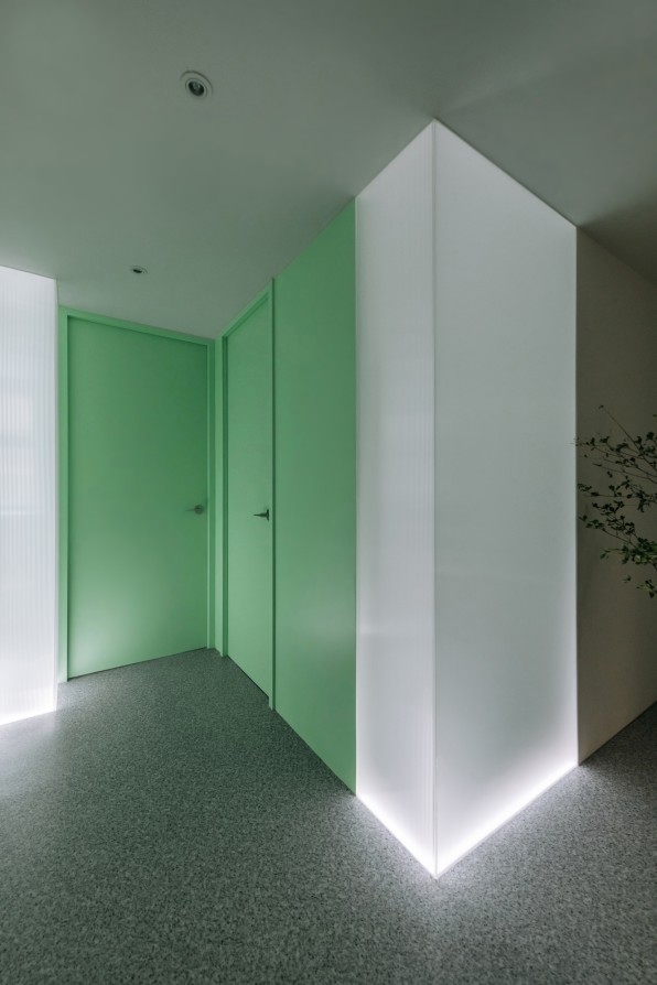
Adrian Chan, an architect and researcher, has always loved the sleek lines of 1960s retrofuturism combined with a muted color palette. Plenty of his past projects leaned on this subdued aesthetic, including his work on Office of Blocks and Longitudinal Studio. Yet, during a recent project he designed for a dietitian’s studio, Chan decided to shake things up by injecting a pop of saturated mint green throughout the space.

The client he was designing for wanted to appeal to a wide demographic, including younger clientele, and this statement green (also described as Neo Mint), felt aligned with a new wave of bold colors popping up in marketing and products. “I think it has to do with technology being all encompassing, but still, people want to be in touch with nature,” Chan says of his choice. “These colors evoke both progress and nature.”
You can see similar shades on Skims’ neon-green swimsuits, Futurewise’s Pepto pink jars, Droplette’s bright lilac micro-mist delivery device, and Starface’s bright yellow brand coloring. It’s there on Lisa Says Gah’s eclectic, avant basic clothes, Ganni’s sherbet-colored dresses, and Parade’s light iridescent gradient Candy Gram silky mesh. Highly saturated brights are everywhere these days, and we have Gen Z to thank for it.
In recent yeas, Gen Z has adopted a distinct palette that has one foot in techno-nostalgia and another in the aesthetics of the current digital world. It’s a preference that’s seeped from viral social media campaigns into Gen Z-focused brands, and finally into the mainstream for everyone else to consume—a perfect, self-fulfilling feedback loop of marketing and trend chasing that leads to the question: How do generations develop their preferences in the first place?

GENERATIONAL COLORS OR A SIGN OF THE TIMES?
Every generation gets its palette, and every palette tells a story. In the 1950s, cool pastels dominated interiors and fashion, signaling idyllic prosperity; in the 1960s, youth culture embraced the brights of psychedelia. The ’80s had acid brights to signal youth and optimism, and early 2000s saw a wave of techno-optimism conveyed through bright pastel shades.
More recently, millennials defined the mid-aughts aesthetic with their unshakable devotion to the warm, dusty hue of Millennial Pink and its neutral counterparts, which Laurie Pressman, vice president of the Pantone Color Institute, believes was both a reaction to shifting gender norms and the quick proliferation of social media aesthetics. “When we saw the rise of Millennial Pink, some of this could be attributed to the shift away from gender rules when it came to color. It could also be attributed to the embrace of the Scandinavian design palette by this generation,” she says.
Pressman has her theories about Gen Z too. “When we think of Gen Z, we think of these bright sunny yellows, a color that signals their more positive outlook—sunshine, warmth, and optimism reflecting a generation with hope for the future,” she says. It’s an association that rides the coattails of the endless conversations about Millennial Pink (and its metallic sister hue Rose Gold) alongside less defining players like Mustard/Goldenrod and Sage Green.
Color forecasting has more than its fair share of pseudoscience baked into the process, as evidenced by the tropes used to describe why certain generations prefer one color over another. The reality is that it’s impossible to paint an entire generation with a broad stroke of color, but that doesn’t necessarily diminish the effort. Colors are a telling, if imperfect, signifier of where culture is heading.
Think of the 1980s—a time when brightly colored leg warmers coexisted with the pastoral fantasy powered by the likes of Laura Ashley. A similar pattern can be observed for Gen Z and its myriads of -cores. Today’s marketing machine is quick to latches onto these micro-trends, creating branding, campaigns, and products that reinforce these aesthetic ideals. And that’s how we get to the notion of a bright Gen Z color palette.
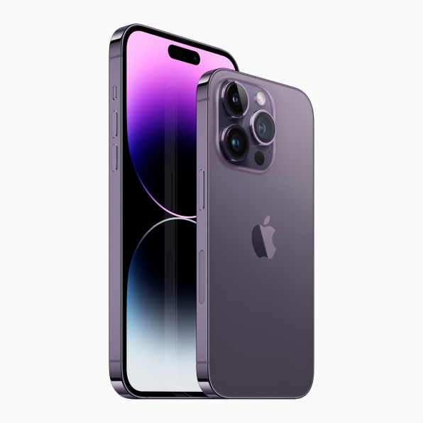
Yet, Gen Z colors are not solely an array of simple brights. Gen Z loves darker hues too, which elicit the vibrancy and vastness of the cosmos, says Caroline Guilbert, head of creative content at Coloro, WGSN’s sister agency. “Gen Z is more grounded in mystery and in celebrating a sense of darkness, not in a depressive way, but as a way of celebrating the whole spectrum of emotions,” said Guilbert. “A color like Midnight Plum embodies that desire for foreign escapism into real and digital life.” In real life, this color can be found on the deep purple iPhone 14; Dieux’s Deliverance serum and Decorté’s Liposome Advanced, to name just a few examples.
Still, this year, leading trend-forecasting agencies and color-forecasting institutes have articulated the rise of so-called animated and electrifying hues: The Pantone Color Institute declared Viva Magenta its color of the year, while Coloro landed on Digital Lavender, a vibrant, yet calming lilac that’s aligned with Pantone’s 2022 pick of Very Peri.
Many of these colors are digitally inspired, says Guilbert. “We’ve seen a rise of aesthetics that have sort of a feel of transparency and dynamic materials,” she says. “Digital designers are driving forward futuristic iridescence. This is taking shape on our screens, but we are now becoming more and more interested in developing them in the physical world because we are blending basically our digital world and/or our physical world.”

Like Millennial Pink, Gen Z colors favor the eye-popping Cyber Lime (forecasted to be big in 2024) and Digital Lavender, also aligned with inclusivity. “[Cyber Lime] can speak to all, which Gen Z is very sensitive to,” said Guilbert. “It also drives that wave of dopamine brights, so it’s definitely an ideal color choice for any type of packaging that wants to bring a little energizing touch.”
THE RISE OF DIGITIZED BRIGHTS
Gen Z’s infatuation with charged brights began while many Zers were still children. “We saw the reemergence of these more electrified shades with the release of Avatar in 2009, whose visual effects took color to another level,” explains Pressman. “Animation, advances in technology, and our immersion in the digital world have only increased since that time.”
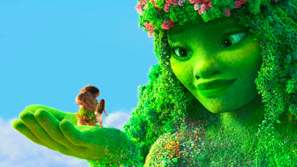
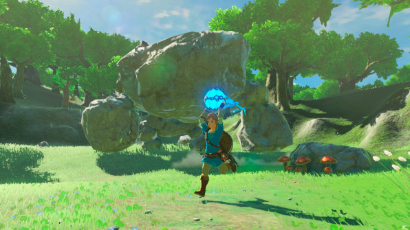
Disney’s Frozen, for example employed immersive brights when fashioning the environments Queen Elsa was most at ease with: the Ice Palace in the first installment, the glacier with the Aurora Borealis in the next. Similarly, saturated, tropical brights defined Moana, and even The Matrix franchise moved away from the somber cyberpunk colors in favor of a multi-hued iridescent-like palette in Resurrection, its latest chapter. The color schemes of Nintendo Switch games, such as The Legend of Zelda: Breath of the Wild and Super Mario Odyssey, also employ a saturated vibrant palette. The fact that anime moved from niche fandoms and online communities hunting for fansubs into the mainstream, thanks to streaming services, can’t be overlooked either.
Actual hues aside, culture is trending toward aesthetics that can travel between the digital and physical realities. “What we are seeing today,” continues Pressman, “reflects the pervasiveness of the digital world in our lives. As our use of technology becomes more prolific, we do anticipate, for the foreseeable future, a demand and desire for electronic brights and fluorescent hues at all levels of design, including product fabrication and multimedia design.”
And so of course, the metaverse and Web3 are the main digital drivers. The creation of such spaces continues to play a large role in the influence of bright, animated, and electrifying hues. The graphic output of metaverse spaces is, after all, limited to a restricted color palette, one that’s reminiscent of what we saw in the earliest form of the internet, but with it remains a sense of wonder tied to the novelty of the medium. “What comes to mind is a box of primary crayon brights,” says Pressman. “Hot yellows and oranges, vibrant purples, bright reds—these too tell a playful story, one that brings us back to our childhoods encouraging play and the joyfulness of creative expression.”

Featured Videos
Today's Top Stories:
More Top Stories:


FROM OUR PARTNERS