
- | 8:00 am
The new Disney+ logo is a beautiful compromise
The company says its new teal color scheme evokes the northern lights, but it might be more about Hulu.


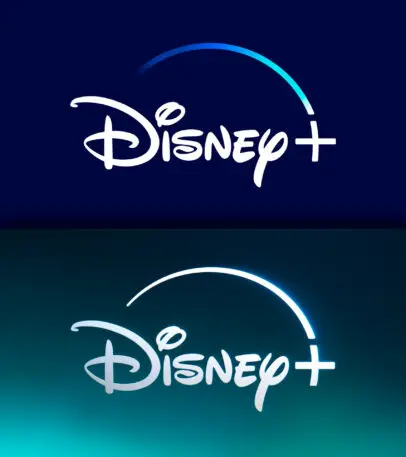
Your streaming service portfolio just got a new color: teal.
To mark its official merging with Hulu, Disney+ has rolled out a new logo for its streaming service app. Out with the blue, in with the teal. The internet is already awash with theories about the color change, the most popular being that Disney+ combined the Hulu green with the Disney+ blue and obtained teal. While that theory is correct, it is only half the story.
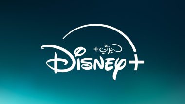
Also, for the first time, the Disney+ MENA logo features an Arabic script.
Teal may come as a surprise to hard-core Disney fans. It might seem fancifully random, or too big of a departure from the brand’s royal blue. But it signals an important evolution for Disney+. “We think we’ve found a balance of new and nostalgic that helps strike a chord that Disney+ has all the things you love about Disney, but is also evolving and adding new things to love, too,” says Andy Baker, VP of creative at Disney+.
In November 2023, Disney bought out Comcast’s one-third stake in Hulu for $8.6 billion. A month later, the company launched a beta version of the Disney+ app, combining Disney+ and Hulu content for bundle subscribers. The Hulu app isn’t going anywhere, but if you’re a bundle subscriber, today marks the official, global launch of Hulu on Disney+. Bob Iger’s long-promised “one-app experience” has arrived—coupled with a refreshed logo that was designed in collaboration with design agency Loyakaspar.
So . . . about that teal! Keen observers might notice that the teal matches that of the commanders’ wives in The Handmaid’s Tale, or the main color of Dopesick—both of which are Hulu shows. But according to a Disney+ spokesperson, the biggest source of inspiration came from the sky—or more exacting, the Aurora Borealis. The northern lights phenomenon doesn’t directly appear in any Disney content, but it’s a representation of the night sky, which has featured so prominently throughout Disney’s history. There’s also Sleeping Beauty‘s Princess Aurora, which gave the color its official name: Aurora.
In the still version of the logo, the northern lights manifest as a subtle gradient, going from a brighter teal at the bottom left corner to a dark teal at the top. The inspiration is more evident in the animated logo that will appear every time you open the app. In the app’s previous version, the Disney word mark appeared first, followed by the star as it swooped over it and dove into a plus sign. The swoop was rendered in a gradient that went from dark to light blue.
In the new version, the swoop appears first; the word mark comes second (perhaps as an attempt to build a slightly less Disney-centric brand). The swoop is now rendered in solid white, and the plus sign is a little thicker to help it stand out on smaller screens.
While the star is swooping down, the background is drenched in darkness. Then the plus sign lights up and the background brightens like a beam of light passing through teal-colored clouds. Immediately after, the lower part of the screen fills up with ever-so-gently dancing teal streaks—kind of like an Aurora Borealis.
All of these changes may seem incremental, but they signify an important shift in Disney’s race to beat Netflix. And nothing signals that better than the actual name of the color, Aurora, which is derived from the Latin word for dawn. In other words: a new beginning for the Disney+ brand.

Featured Videos
Today's Top Stories:
More Top Stories:


FROM OUR PARTNERS