
- | 2:00 pm
YouTube is on a major decluttering mission
Over the last year, YouTube revamped its design process and overhauled its watch experience through dozens of tiny tweaks that you feel more than see.
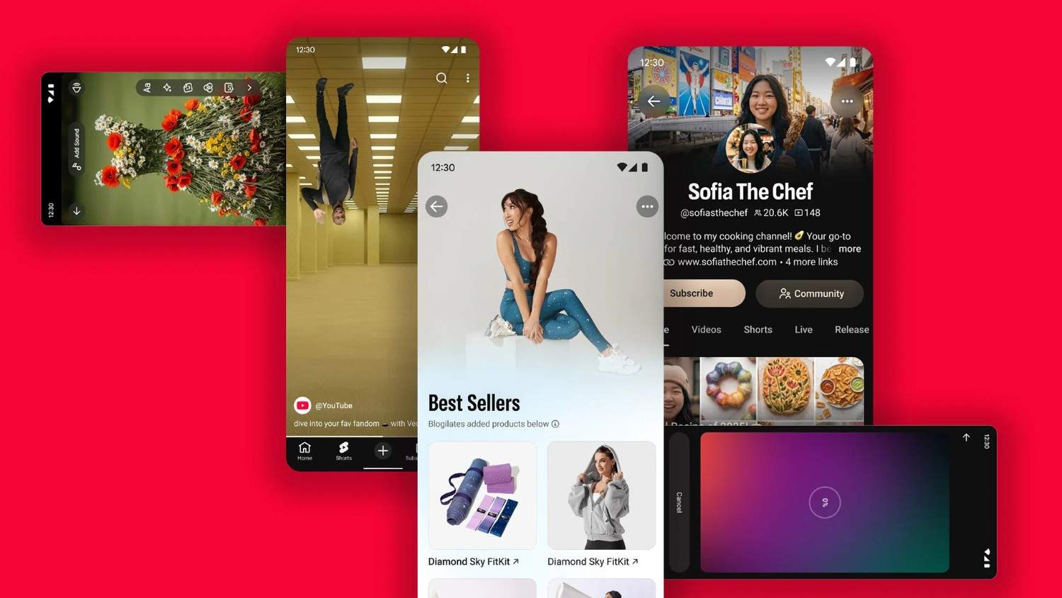


YouTube has ballooned from a small selection of low-resolution videos in 2005 to a total library of more than 20 billion videos uploaded. Over the course of two decades, it has introduced a bevy of new features including YouTube Premium, Shorts, and YouTube Shopping. Today, it has billions of logged-in monthly users.
But as YouTube’s user base and content have expanded exponentially, the platform’s actual design has struggled to keep pace. Historically, YouTube’s product team was guided by boosting traditional KPIs without any clear design infrastructure, resulting in cluttered interfaces, distracting pop-ups, inconsistent iconography, and an overall clunky user experience.
Now, for more than a year, the company—headed by design lead Jonathan Terleski—has been quietly working behind the scenes on what Terleski calls the “most significant design overhaul in YouTube history.” Terleski’s team is working to cut back YouTube’s unnecessary features and replace them with a streamlined design that includes fewer buttons, clearer user and creator homepages, and a better viewing experience.
![[Image: courtesy YouTube]](https://images.fastcompany.com/image/upload/f_webp,q_auto,c_fit,w_1024/wp-cms-2/2026/07/i-6-91580299-youtube-redesign.jpg)
[Image: courtesy YouTube]
“We’re at a pretty incredible scale, and as part of that, many of our surfaces have become noisy, less clear, and less simple than they otherwise could be,” Terleski says. “What I’m trying to do here is really step back and say, ‘Let’s look holistically at this. If we were designing all the things that we now know as YouTube, how might we have done it differently?’”
The resulting changes are evidence that often it’s the least obvious features that make the biggest impact on user experience. And, Terleski hopes, they’re also a key “business lever” that will keep viewers coming back for decades to come.
![[Image: courtesy YouTube]](https://images.fastcompany.com/image/upload/f_webp,q_auto,c_fit/wp-cms-2/2026/07/i-9-91580299-youtube-redesign.jpg)
[Image: courtesy YouTube]
YouTube’s new design culture
The first step in YouTube’s design decluttering didn’t actually have anything to do with the platform’s visuals—it started with the company’s culture and organization.
Before Terleski’s major initiative, YouTube’s design was handled with a fairly siloed approach. Teams dedicated to different components of the platform, like the YouTube Music and YouTube Living Room teams, would be responsible for owning the design of their products.
Without any formal guiding design principles, UI decisions were made primarily with performance KPIs in mind, turning aesthetics and usability into more of an afterthought. For example, illustration styles might differ across the brand’s apps; information was often not organized in the most legible order; and layers of updates over time resulted in repeated information or defunct buttons.
To start addressing this lack of a cohesive design approach, Terleski instituted a new cross-functional “design systems team.” Composed of engineers, product managers, and UX designers, this team’s sole job is to create a unified, “delightful” design system across the entire platform, working in tandem with smaller product teams.
“The question we really started asking ourselves was: ‘Do we have the right design system in the first place?’” Terleski says. “And I think that’s been the biggest shift, to say, ‘No, we don’t.’
Terleski’s objective with the new design system was to turn YouTube into the “world’s best stage” for creators. This goal was the north star as they created a list of guiding principles that the design systems team could keep coming back to. The playbook revolves around five objectives:
- “Make content the star,” which means keeping any UI around or on top of videos as minimal as possible.
- “Prioritize relevance ruthlessly,” which requires looking at user data to judge whether a feature is working.
- “Choose the simpler option” by eliminating redundant user journeys.
- “Be a good neighbor” internally by ensuring that new features fit within the overall UI.
- “Build for the ecosystem” by considering design at the very beginning of any product engineering process.
Terleski says the combination of a new design team structure, a clear design playbook, and top-down support from YouTube CEO Neal Mohan is already having a noticeable impact: Today, his design teams are able to ship UI fixes in days that would have before required entire weeks.
“Previously, we didn’t have any top-level goals for things like simplicity and clarity,” Terleski says. “Now, those are company-level goals that we have at YouTube that really incentivize teams to come along on the journey.”
![[Image: courtesy YouTube]](https://images.fastcompany.com/image/upload/f_webp,q_auto,c_fit/wp-cms-2/2026/07/i-7-91580299-youtube-redesign.jpg)
[Image: courtesy YouTube]
Inside YouTube’s Lego-style decluttering
Terleski imagines YouTube’s new design initiative as a kit of Lego components for the platform. First, his team decides which visual components—like fonts and icons—are actually worth making a part of the kit; next, they make a manual of how and when those components can be joined together.
“That’s been a big step forward—going from just component reuse to being like, ‘Yeah, but are we using them correctly? What’s the instruction manual that comes with the box of Legos that tells you actually how to put the thing together versus just assembling how you will?’” Terleski says.
Some new pieces have been added into YouTube’s overall design language, including a font called “Marquee,” inspired by the brand’s wordmark; subtle aura backgrounds; and dynamic glassmorphic buttons. In combination, these features are helping to make YouTube’s information hierarchy more clear.
![[Image: courtesy YouTube]](https://images.fastcompany.com/image/upload/f_webp,q_auto,c_fit/wp-cms-2/2026/07/i-2-91580299-youtube-redesign.jpg)
[Image: courtesy YouTube]
On an old viewer homepage, for instance, the name, image, and handle of the viewer got lost in one undifferentiated section of the screen. Now, the viewer’s profile picture and name, set in bold letters, take up a much larger chunk of the screen, offset by an aura background that draws attention to those details. These changes, though small, help the user’s eye to more smoothly travel down the page and focus in on its most important features.
Oftentimes, the bulk of the design systems team’s work has consisted of weeding through layers of redundant UI cues that have accumulated on YouTube’s surfaces over the years and distracted from its actual content. One example he points to is an old watch page that included two different play buttons, a non-functional back button, overlapping captions and chapter titles, 10 repetitions of a channel name, two different callouts to YouTube’s “Ask” search feature, an action bar with 13 different choices, and two different references to the creator’s store.
![[Image: courtesy YouTube]](https://images.fastcompany.com/image/upload/f_webp,q_auto,c_fit/wp-cms-2/2026/07/i-11-91580299-youtube-redesign.jpg)
[Image: courtesy YouTube]
The redesigned version of the page has culled out those repetitive features and streamlined the action bar so that the video itself, its title, and the comment section are the three elements that stand out the most. Terleski’s team even swapped the former white background with a dark screen which, he says, has been shown in user testing to keep viewers’ attention focused on what they’re actually watching.
![[Image: courtesy YouTube]](https://images.fastcompany.com/image/upload/f_webp,q_auto,c_fit/wp-cms-2/2026/07/i-12-91580299-youtube-redesign.jpg)
[Image: courtesy YouTube]
“The cleaner we keep this page, the more engaging it is to people, because we’re letting them focus on what they’re here for—which is watching the video and sticking around,” Terleski says.
What’s next
These subtle tweaks are already having a measurable impact on how viewers engage with YouTube. Terleski says cleaning up the watch page has significantly boosted user engagement and watch times, though YouTube was unable to provide metrics. He says that, in turn, has resulted in a revenue bump, which his team has used as an opportunity to eliminate billions of “leave-behind ads,” or the small ad bars that used to show up at the bottom of a video after the full-screen ad had already played.
“Those kinds of things that are seen as either distractions or requests for attention from users, we find that they’re actually correlated in an opposite direction with engagement and watch time,” Terleski says. “It’s not true all the time, but there’s a big class of problems where, when you simplify the experiences to focus on why most users are there, it correlates strongly with core metric gains and revenue gains.”
In essence, YouTube is finding that simplifying its viewing experience is both better for users and for business—and, Terleski says, the changes that have already been made are “only the tip of the iceberg.” Going forward, users can expect to see the platform slowly becoming more “dynamic,” “immersive,” and “animated.” The updates will continue to roll out in bite-sized pieces to allow viewers and creators to adjust over time.
YouTube is making a bold bet that an obsessive focus on design will boost its health in the long term—and Terleski, for one, is confident it’s going to pay off.
“There’s a lot of competition out there,” Terleski says. “At the end of the day, we want people to choose YouTube because they love to use it. We want creators to choose YouTube because they feel like it’s their home and it’s the best stage for their content. At the end of the day, that’s why we’re here.”
Featured Videos
More Top Stories:


FROM OUR PARTNERS