- | 8:00 am
The best book covers of 2023 are the ones you’ll never see
The most interesting book cover designs are often left on the cutting room floor.
Charlotte Strick was on a high.
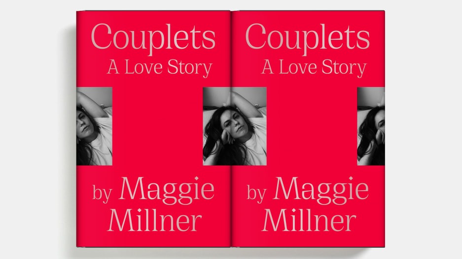
She’d been tasked with designing the book covers for the English translations of Karl Ove Knausgaard’s six-part autobiographical novel, My Struggle—and she’d landed on a concept to tie the volumes together. Perhaps surprisingly, everyone else had, too. The collaged, Easter egg–laden set was an immediate hit in cover meetings at Farrar, Straus and Giroux, and the first book had hit shelves, but then Strick says a literary agent intervened. The books looked too artsy, and he wanted something more straightforward to reach the masses. So with only one installment on the market, the line got scrapped for a more traditional look—author photo with big, clean type, and a solid blurb.

“There’s nothing scarier than [someone saying], ‘this book is not going to sell with that cover,’” Strick says. “So any initial love kind of gets pushed aside.”
She was crushed (as are the people who still reach out to her to this day to ask where they can get the complete set). But the whole episode underscores a larger fact that I’ve come to believe after writing about book covers for years—killed covers are often where you can find the really great stuff. The surprising work. The refreshingly genre-breaking, exciting, unfiltered output that nudges the field toward its next evolution.

Ultimately, when you see a book cover in a store or online, you’re really just seeing the tip of the iceberg. Because at most of the really big imprints, that cover probably went through the ringer.
Strick says that in general, the process begins with a designer receiving the manuscript and a jacket brief outlining the mandatory elements (e.g., title, author name, maybe a blurb), and comparison titles for reference. The timeline is usually tight, and when it comes down to it, the creative stakes are high: You’re essentially tasked with creating a single image to brand thousands of words that could have been years in the making.
“It’s tough, because to the author, it’s their baby,” Strick says. “And in some cases, they’ve been working on this for a decade. And you have two weeks to come up with an idea.”
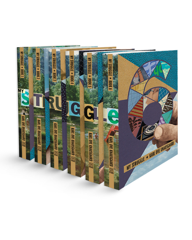
From there, designers create comps, or a series of proposed designs for the team to weigh. The reasons why some comps meet untimely ends are many, from an editor or marketing lead’s personal preferences to genre conventions to performance metrics of similar approaches to the author’s best friend’s opinion or, maybe, the sheer fact that an exec has a cold that day. Of course, this isn’t to say that what hits the market is bad—in fact, I’d contend we’re in a golden age of book cover design, with each publishing season bringing a deluge of insanely great jackets. But at the end of the day, a lot of fantastic and fascinating work hits the cutting room floor.
So as “Best Book Covers of the Year” lists pop off this month, let’s celebrate the work that didn’t win the day. Here are some of the best book covers of 2023 that you did not see—with insight directly from the designers who created them. The version that ended up being scrapped is on left, the final version is on the right.

“I love the cover that was chosen so much (the big dark waves backdropping the brittle lines of sheet music evoke the sweeping story and emotional impact), but there is one outtake that is stuck in my head when I think of the book. There is one scene at the end that I can’t let go of: Music tying two people together is played, and images of people lost appear in redacted colors of light. Whether real or illustrative, this is the image that held everything that happened in the story in a suspended moment before the exhale of finishing the book. I wanted to create that scene but without any visual clutter of a setting, other objects in the room, or even people. In this outtake everything but the crucial information fades to black. It is the simplicity and starkness that I find so appealing.” —Math Monahan

“I’ll Be Seein’ Ya by Jon Robin Baitz is a play set in turbulent COVID times, examining the relationship between nostalgia and the ever-looming anxieties surrounding mortality and old age. I began with this painting by artist Perry Vásquez. The spontaneously combusted palm tree captured the sudden, disorienting, and solitary atmosphere of living alone in pandemic times, while also alluding to the LA forest fires. I enjoyed how this symmetrical, two-paneled composition suggests a ‘before and after’ sequence marking the initial spark and the gradual expansion into forest-fire-orange California sunset.” —Cecilia Zhang
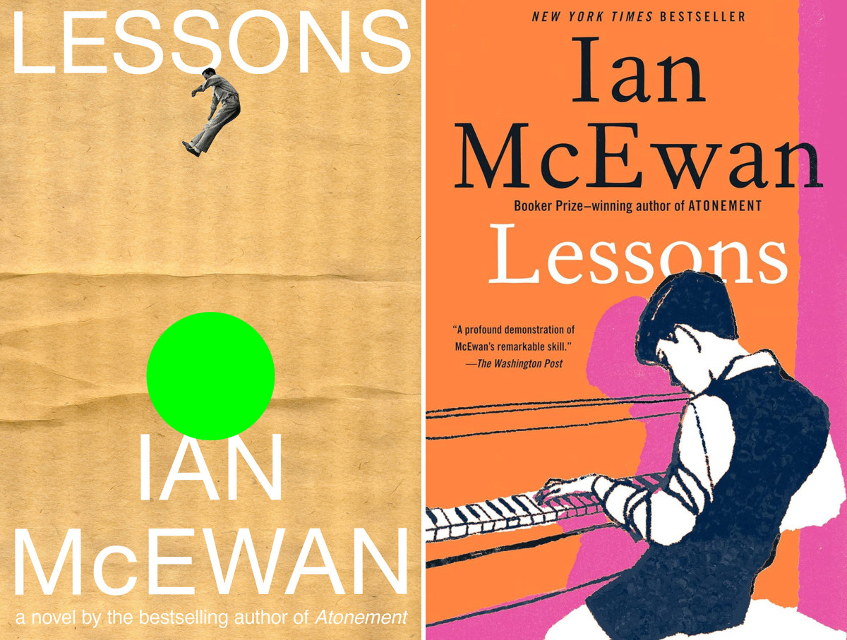
“Critically acclaimed British novelist Ian McEwan has quite the roster of books, and with that (no surprise), he has built a visual brand in his covers. I thought it would be exciting to simply go against the brand, and view his name in a different light. With instruction to avoid using a piano, I tried doing something I thought of as playful and British, while still remaining true to the tone and sophistication of his writing. I don’t remember it going over all that well!” —Janet Hansen
(For this edition, the publisher would ultimately keep Tina Berning’s art from the UK release.)
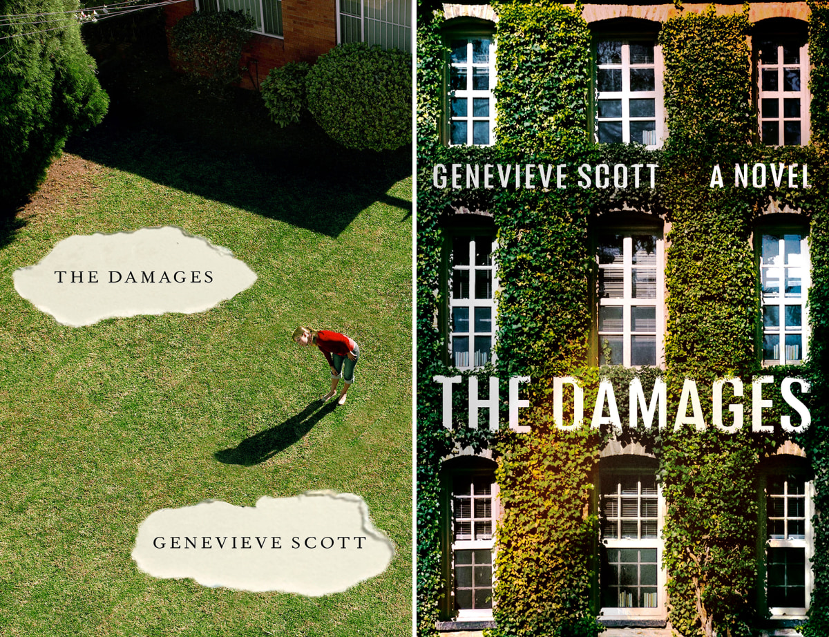
“The Damages is about a woman who is forced to reckon with her past after her ex-partner—the father of her child—is accused of sexual assault. On the cover, I wanted to create a sense of rupture . . . a sense of buried information coming to the surface. To make the artwork, I started with a Getty image of a woman looking into her mailbox. Then I edited out the mailbox to give the photo a surreal quality. With the mailbox gone, the woman appeared to be looking at nothing . . . to be looking at her life. Then I added the holes. I liked the idea of representing ‘damage’ this way—as holes in the character’s life that also function as gashes on the book itself—gashes exposing hidden words. The concept made sense to me, visually and thematically. ‘Damage’ is the impact that words have when they are buried for too long.
“Like so many ideas, this concept did not make it onto the final cover. The editorial and sales teams wanted something more commercial, with a bigger sans-serif typeface for the title. This is pretty typical feedback for a book designer to hear. We are always walking a fine line between the commercial objectives of the work and our own idiosyncratic sensibilities. I often gravitate toward weirder, quieter designs, but sometimes the material warrants something with a broader reach. The surreal absurdity of the ‘holes’ design was not the best tonal match for the content. We ended up going with something simpler, but still striking. A college dormitory—the scene of the alleged assault—with the word ‘damage’ looming large overhead.” —Kate Sinclair
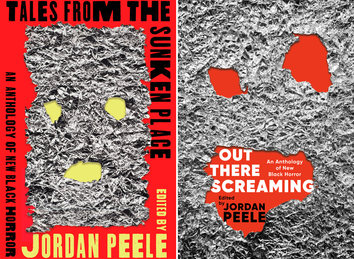
“I’ve developed a gut feeling toward comps that I think will win the final vote. I wasn’t far off in the case of Jordan Peele’s new anthology of Black horror. What made this comp stand out for me was its overall configuration. I appreciated the way the type wraps around the edge of the cover; the variation of Thunderhouse Pro’s thicks and thins, along with its distressed fill, framing the artwork by Arnold J. Kemp. I enjoyed cutting into the foiled artwork and featuring some ragged edges that creeped out a bit onto the type, and the pop of neon lime in contrast with the red. The title was ultimately changed to Out There Screaming to strengthen the unique creative exploration of each author’s ‘Sunken Place,’ instead of sticking strictly to the idea of the Sunken Place within Jordan Peele’s work.” —Janay Nachel
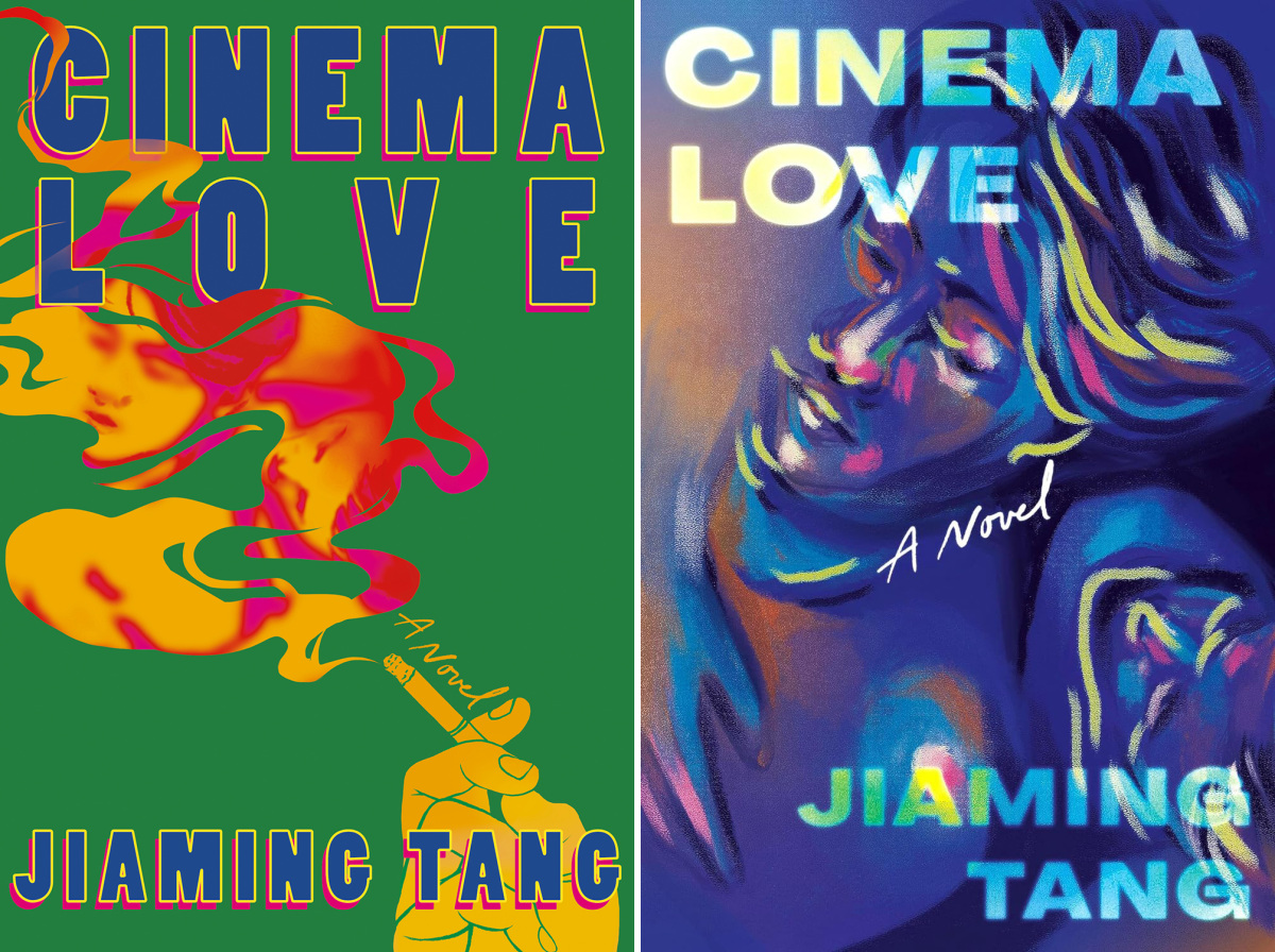
“Cinema Love centers around a queer couple in post-socialist China whose illicit relationship begins and blooms in the darkness of an old cinema. We follow the ripple effects of their connection through subsequent generations until we arrive at present day New York City Chinatown. Upon meeting in the theater for the first time, the couple exchanged a cigarette—and I immediately tried using this visual to evoke a sense of intimacy and temporality. Hazy cigarette smoke felt appropriate: fleeting, moody, a little retro in this context. I wanted to anchor the motif down with a representation of the couple themselves, and I thought it felt appropriate to have them a bit vignetted to convey a sense of the past. I’m genuinely really happy with the final cover—which feels so true to the story in a different way to me—but am still so fond of this version, which I think nicely anchors the hazy wistfulness of their love story with a graphic starkness.” —Dana Li

“The title Hangman has so much visual significance that I found an irresistible opportunity to pay homage to the timeless allure of the classic Hangman game.” —Alex Merto
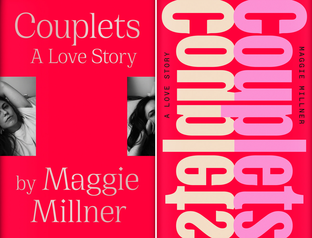
“We had this beautiful portrait of [author] Maggie [Millner], and we were interested in the idea of doubles and reflections, as the book itself is written in couplets. We ended up going in a totally different direction, but I loved these simple, sexy, modern comps that totally match the author and her prose. We envisioned printing over foil for added depth and subtle reflective quality over the type and image.
“These two below felt odd in a fun way. I feel like some books just call for that kind of attention. It’s not always that I get away with it, but I love when I do. (On that note, FSG has really been amazing in that sense. They put tremendous trust and agency in the art department that often allows us to create some of the funnest/more ‘different’ covers, in my opinion.)” —June Park

These responses have been edited for clarity and space.


