- | 9:00 am
We’ve had enough of smart city clichés in visual design. Here’s a way to make it real
Let’s move away from waves of light and flying numbers, and focus instead on showing the tangible difference new technologies could make to a place, and to the lives of people that live and work there.


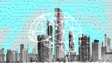
What comes to mind when you think of a smart city? A web of blue and white orbs against an evening sky? Maybe some icons floating above the rooftops, or a wave of binary superimposed on a cityscape? A turquoise infographic or two? Search “smart city” and you can see just how uniform this visual shorthand has become.
Motion blurs and flying numbers over the city are supposed to signify an efficient flow of systems, data, energy, and information. According to color theorists, blue is the color of trust and clarity, as opposed to red, used in a similar context to signify risk or data security. The web or net symbol is a very literal way of making visible the idea of connectivity, of linking nodes.
But technology has moved on from the telephone line—it isn’t so linear. In a way, these images are drawing on analog concepts to try and visualize today’s dispersed, wireless networks. They pretend to map sensors and data points of various city systems, yet are mostly sci-fi fantasy.
Early ideas of the smart city didn’t draw on the same visual references. In 2008, IBM launched their Smarter Planet vision, which proposed exploiting the interconnectivity of power grids, food, water, traffic, and healthcare systems, enabled by “sophisticated analytics and algorithms that could make sense of it all.”
The concept was by Ogilvy & Mather and IBM, and the visual language was developed with San Francisco agency, Office. There were no webs of light but, instead, colourful motifs that illustrated the project’s objectives. As Office wrote in its case study, it was “a graphic language that could illustrate these complicated solutions in a way that was visually arresting and distinctive, yet simple and approachable enough to be easily understood around the world.”
Somehow, from the singular idea that connected technologies could improve urban life, tech firms ended up with a much more nebulous way of expressing this connectivity. You could argue that the resulting imagery has distanced useful technological advances from their purpose—and from the people that could stand to benefit.
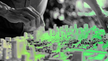
And just as these illuminated webs are a bit of a turnoff, so are many visualizations of future transport. I’m thinking of the ones that show beatific couples spirited around in shuttles between futuristic towers in a perpetual golden hour. There is a lie in their two-dimensional promise of the future, because it doesn’t see the city as a holistic, complicated whole. A world with self-driving services may not be so far away, but they won’t necessarily be the defining element of our streets. Some of us will probably still ride old bikes, there will be people walking, wheeling, signposts, deliveries, litter, trees—all the chaotic, unplanned details that give a city life.
WHAT THE COMPONENTS OF A SMART CITY REALLY LOOK LIKE
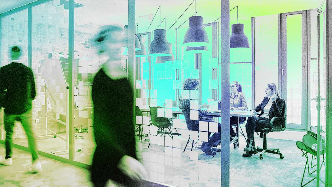
For a while now, I’ve been asking some of the project teams I work with to send site photographs of any new installations—“no image too boring”— and they have delivered. IoT, ultrafast connectivity, damp monitors: None of these announce themselves with a beam of light; the reality is much more prosaic. In fact, much of the action is buried underground or in a cupboard. A camera on a lamppost, a small white box on the side of a brick wall, easily mistaken for a meter cabinet.
But what that box represents, in one case at least, is the ability to easily switch broadband supplier. The contents of the box help council tenants in one London block get a better deal. And that camera, connected to a monitoring app to alert the maintenance team to issues, makes life harder for people trying to illegally dump waste, gathers evidence more efficiently, and helps to improve the neighborhood.
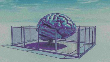
There’s perhaps a reason why mobile masts and boxes aren’t overtly shown. In my view, much could be done to improve their urban presence. But picturing technology as an ominous urban forcefield can’t do much for public engagement either, particularly when it comes to connecting with those skeptical of big data, 5G and, most recently, the idea of the 15-minute city.
What’s more, the sophisticated new AI imaging tools we have at our disposal may just generate more of the same. As these models learn from existing visual references, we could find ourselves bathed in binary, in an echo chamber of ever more clichéd imagery.
But it’s easy to grumble. What should we be trying to show instead? I think we should be focusing on the outcome, on what we anticipate a new service or solution could deliver. Not to oversell it, but to illustrate what it’s supposed to do. If we’re looking at the potential impacts of some of today’s neighborhood-level IoT, electrification, or connectivity projects, for example, the picture is very different.
It might just look like a child doing their homework or streaming a game. It could mean interviewing for a job without the screen freezing awkwardly. It might be the quiet rounds of an electric garbage truck, a safe journey home from a night out in a shared mobility service, or a new way to gather a community’s views on local issues. Or it could be a lifeline: a health alarm, a home free of mold and damp, an accessible link to vital services. Technology touches so many aspects of life, from the mundane to the extraordinary, and it is these human interactions we should be seeing.
So, let’s not default to the industry standard. No more retro-futuristic webs of light, because the future of any smart city must be about people—and understanding how the application of new technologies could make their lives better. Even if that really just looks like a box in a meter cupboard.

Featured Videos
Today's Top Stories:
More Top Stories:


FROM OUR PARTNERS