- | 8:00 am
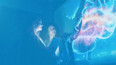
When you win a Nobel Prize, this illustrator beautifully explains your idea
For the last 13 years, Johan Jarnestad has translated the Nobel Prize winner’s wildly complicated concepts into easy-to-understand illustrations. Here’s how he does it.


Every year, six Nobel Committees get together to select Nobel Prize laureates in six categories. The selection process is shrouded in secrecy (each category short list is kept under wraps for 50 years), but we know that it takes months. Each category is largely helmed by one group that then consults with thousands of other professors and Nobel Prize laureates to ultimately choose the winner.
Sometime toward the end of the process, four other people are brought into the process: a writer, a translator, a project leader, and an illustrator. That illustrator has been the same person for the past 13 years. His name is Johan Jarnestad, and his job is to translate wildly complicated concepts that scientists have spent decades researching into bite-size, digestible vignettes for the general public to understand. The ultimate goal? Make science more accessible.
Half of the Nobel Prizes (in Physics, Chemistry, and Economic Sciences) are awarded by the Royal Swedish Academy of Sciences, an independent organization with a mission to promote natural sciences and mathematics. The other half are awarded by the Karolinska Institute in Stockholm (for Physiology or Medicine), the Swedish Academy (for Literature) and The Norwegian Nobel Committee (for Peace)—and the process is different for each of them.
Over the years, Jarnestad has illustrated a whopping 39 Nobel Prizes for The Academy, with more than one illustration per laureate. Most of these illustrations are used in press releases for the media as well as papers intended for the general audience. Some end up on The Academy’s social media accounts. Sometimes, Jarenstad says the laureates end up integrating them in their own lectures, which is always gratifying.
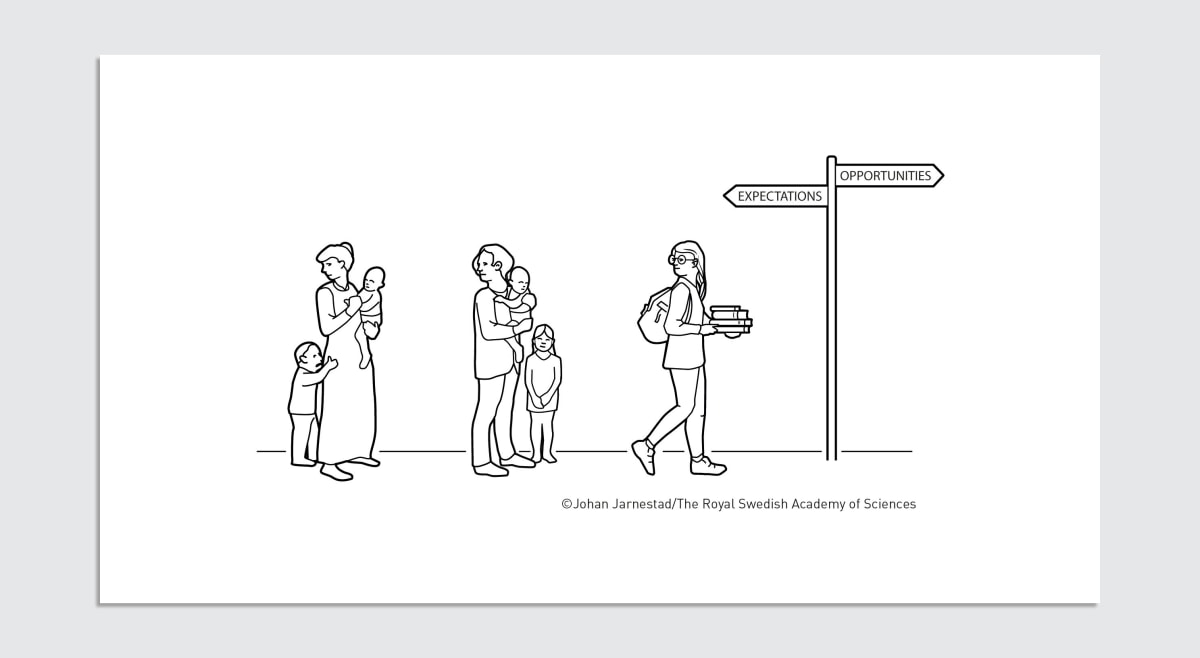
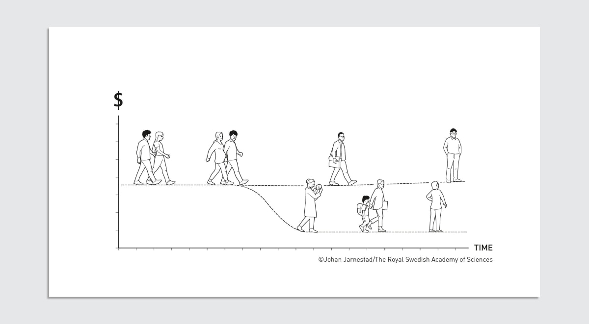
Just this month, Jarnestad created four illustrations related to the American economist Claudia Goldin, who was awarded the Nobel Prize in Economics for advancing the understanding of women’s labor market outcomes. In one of them, Jarnestad illustrated how women’s career choices have been influenced by expectations with an image of three different generations of women standing on one path: the first two are holding babies and looking back at their mothers, the last woman is looking back but also stepping forward with a stack of books in her hand. A sign at the end of the road points in two opposite directions: “expectations” facing backwards; “opportunities” facing forward. The illustration is simple, but it crystallizes a much more complex pattern identified by Goldin: In the 20th century, the earnings gap between women and men hardly closed, which the economist attributed to the fact that women decided how much (and how hard) they would study based on what their mothers were doing.
A self-described “science geek” and journalist by training, Jarnestad grew up visiting his father’s artist studio. “As a kid, I thought his job was to smoke his pipe and look out the window,” he says laughing.
Over the course of his 25-year career, Jarnestad’s illustrations and infographics have been published in prestigious science magazines like Nature, Science, and the Swedish popular science magazine, Forskning & Framsteg.

With the Nobel Prize projects, the output always varies, but the process is more or less the same: Jarnestad sits in on meetings with the respective Nobel Committee, where he draws and listens at the same time. Oftentimes, fragments of drawings start materializing in his head before the larger image appears. And whenever he doesn’t understand a particular concept, he asks questions. Lots of questions. “You have to accept that you don’t have the tools these people do,” he says, “but at the same time, it’s a perfect environment to work in because these are people who lecture; they are very comfortable transferring information.”
Throughout, he follows his own set of criteria for his illustrations: Is it correct? Is it understandable by someone who doesn’t have access to the kind of information he has? Is it pretty? “That’s my mantra,” he says.
Illustrations have been a core component of The Academy’s mission from the very beginning. Karl Grandin is the director of Center for History of Science, one of The Academy’s research institutes. He says that publishing a journal was the first decision The Academy took when it was founded in 1739.
Back then, the idea was to publish “useful findings” that were submitted not only by members of The Academy—mostly professors—but by anyone with an interest in natural history. (Grandin suspects typical subscribers were likely vicars with an interest in natural history as they had the means to buy the journal.) Early copies of that journal show detailed illustrations of botanicals, butterflies, and various concepts of physics. As Grandin notes, the scientific concepts of the time may not be as technical as they are today, but the intent behind the illustrations was the same as it is today.
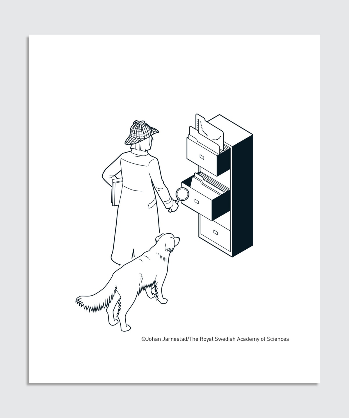
Which brings us to the fourth and final illustration in Jarnestad’s arsenal: the one for social media. For Goldin’s prize, Jarnestad illustrated the economist wearing a detective hat and wielding a magnifying glass in front of a filing cabinet, while a trusty golden retriever stands by her side.
The dog was a unusual addition, but it brings a personal touch, as Jarnestad learned that the economist has a dog named Pika. “I want her to recognize herself; I want her to feel that we know her a little bit,” Jarnetsad says. “It’s not just about science, it’s also a little bit about the person.”
The Academy’s social media strategy is fairly recent. Sara Rylander, who is a communications officer at The Academy and who approves Jarnestad’s illustrations alongside the Nobel Committee, says her team came up with the idea about four years ago. “It doesn’t have to explain everything, but it has to catch your eye and get you interested,” she said, noting that her ultimate hope is for someone who isn’t typically interested in science to click for the illustration then stay for the content.
In that sense, illustrations like Jarnestad’s are a vital communications tool in The Academy’s efforts to not only promote but also democratize science. As Rylander put it to me: The illustrations can’t stand on their own, but the text wouldn’t work without them either.

Featured Videos
Today's Top Stories:
More Top Stories:


FROM OUR PARTNERS