- | 9:00 am
The origin story of the Air Quality Index—and the toxic ‘smaze’ that came before it
When wildfire smoke proliferates, people flock to the Air Quality Index. But it was a long time coming.


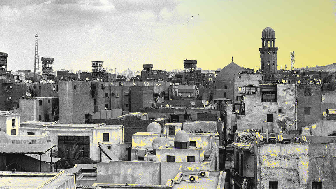
In the 1950s, a toxic shroud of pollution settled over New York City for six days as a shift in the weather trapped emissions from local coal power plants, factories, and cars. Some people called it “smaze,” a portmanteau of smoke and haze; the word smog hadn’t been fully popularized yet. After pollution levels spiked, dozens of people died. The same thing happened in 1963 and 1966.
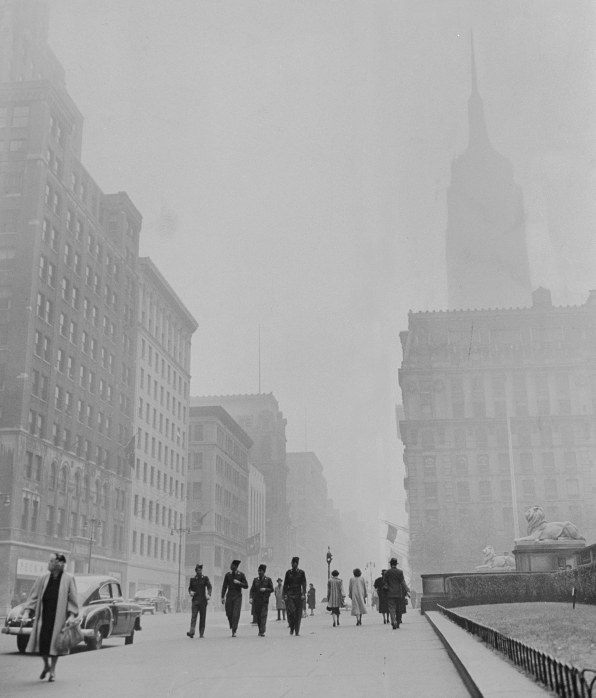
At the time of the 1966 event, the city had a single air quality monitoring station in Harlem, and only a crude version of an air quality index that combined different pollutants into a single number, which the city used to decide when to issue warnings. But the city’s dismal air quality was one of the factors that helped lead to the creation of the Clean Air Act, the Environmental Protection Agency, and, later, the color-coded version of the EPA’s Air Quality Index that exists today.
“There were lots of days when the air looked as polluted as we saw last week [with the Canadian wildfire smoke],” says David Hawkins, now a senior attorney at the environmental nonprofit National Resources Defense Council, who was a law student at Columbia University in the mid-1960s.
Even on an average day, pollution levels were high. “You had apartment building incinerators that were essentially burning trash uncontrolled,” he says. “You had a lot of building furnaces that were being heated with coal or very dirty oil. You had power plants that were largely uncontrolled. You had automobiles, trucks, and buses that were completely uncontrolled. The air quality was very bad. We lived in an apartment building where you could open the window and wipe the windowsill clean in the morning, and by the evening it would be dark gray.”
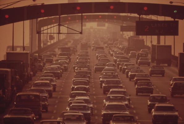
Other cities, like St. Louis, Chicago, Pittsburgh, and Los Angeles, also had bad air quality and experienced spikes of severe pollution. “Those episodes led to increasing activity at the city level,” Hawkins says. “And then city politicians basically realized that they needed to have more backup in order to be able to actually succeed in cleaning up some of these big polluting facilities. So they started agitating with the state governors, and then the state governors started agitating with the federal government.”
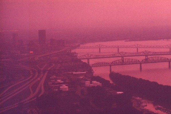
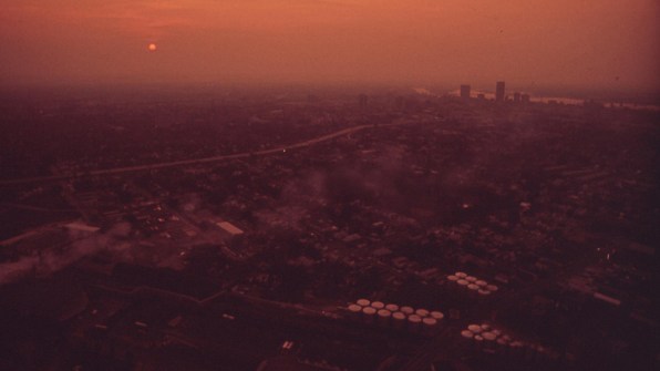
Congress passed the Clean Air Act in 1963, authorizing research into pollution control, and then made it much stronger in 1970, giving the government the power to limit pollution. The EPA, also created in 1970, had the power to enforce the new law. The challenge was widespread across the country. The newly formed EPA sent photographers to document some of the pollution in the 1970s, including orange smog over Cleveland, and in Louisville, Kentucky.
By 1976, with a mandate from Congress to share air quality data, the EPA created the “Pollutant Standards Index,” which provided information about pollution levels from the previous day. “Basically, it was about yesterday’s air quality, and it was a notice in the newspaper,” says Melissa Sullivan, a spokesperson for the EPA.
Until that point, the 55 largest urban areas in North America used 14 different scales for air pollution, and each city used different warning messages, so there were essentially 55 different systems. In San Francisco, for example, a rating of “25” meant a “severe” level of pollution. The same number in Miami meant “normal.” In Cincinnati, it meant “excellent.”

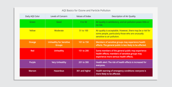
The new index, designed to be used anywhere in a standardized way, created a scale from 0 to 500 for five major pollutants—carbon monoxide, particulate matter, sulfur dioxide, nitrogen dioxide, and ozone. “Good” air was in the 0-100 range, “moderate” air was 100-200, “very unhealthful” was 200-300, and “hazardous” was above 300.
By the late 1990s, when it became possible to share data quickly online, the EPA decided to tweak the system, creating the Air Quality Index in the form that it exists today. The AirNow website was created to report data from pollution monitors as quickly as possible, beginning with ozone monitors that measured ozone pollution continuously. A new level on the index, “unhealthy for sensitive groups,” reflected the fact that some people are impacted more because of existing health conditions or their age. Air pollution can trigger asthma attacks and heart attacks and worsen other conditions; at higher levels, prolonged exposure can cause new heart and lung disease in people who were previously healthy.
Each level on the index was also assigned a color—green is best, maroon worst—so when local news made maps or charts, the colors would be consistent. (Newer crowdsourced real-time maps from companies that sell home air monitors also use the same colors.)
“I think the color scheme is really helpful—numbers are hard to remember and don’t evoke feelings,” says Rachel O’Brien, an assistant professor of civil and environmental engineering at the University of Michigan who studies aerosols and their health impacts. “The color is a lot easier for people to just immediately look at and know, ‘This means that this is bad,’ or, ‘Okay, things are fine.’ You don’t have to spend a lot of time thinking about what the color means.”
While some air pollution is obvious, like wildfire smoke, the Air Quality Index can also make people more aware of pollution that’s invisible. “Ninety-nine percent of the air pollutants, by weight, are gaseous pollutants, so most of those are not detectable,” says Jonathan Deason, an engineering professor at George Washington University.
He says the EPA could potentially add other features to make the data hit harder; for example, an index from the University of Chicago converts air pollution data into life expectancy. In some cities in India, cleaner air could mean living eight years longer. In parts of California, cleaner air could mean living six months longer. Still, the Clean Air Act has already been very successful in the U.S.: Since the EPA launched in 1970, combined levels of the six most common air pollutants have dropped 78%. The filthy skies that were common half a century ago have largely disappeared, despite efforts to weaken the EPA’s power.
If visible pollution helped lead to policy change in the 1960s and ’70s, pollution from wildfire smoke might help do the same thing now for climate policy. “Our brains are wired to respond to offensive smells and skies that look terrible,” Hawkins says. “Our brains react to that in a way that reading a newspaper article doesn’t. So I very much think that these kinds of episodes are bringing home that reality in a visceral way. That is very likely to help motivate more demands for action.”